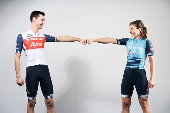
Trek-Segafredo revealed their kit for 2021 with the men’s jersey receiving only small changes while the women’s kit features similar patterns to the 2020 kit with what the team calls “a remixed color palette.”
Lead designer Brian Lindstrom explains how we reached the new livery: “The women’s kit has a strong identity with the pattern; it seems to have taken hold and people like it. When designing the new kit, we thought about taking that foundation and spinning around the colors to see if we could get something fresh that updates it. The light blue is borrowed from our Trek Factory Racing cyclocross team. It’s been in our brand repertoire for a few years now, so it felt like a natural progression.”
Only the keenest eyes will be able to spot the minimal changes to the men’s kit. Trek-Segafredo opted to retain the classy design from 2020 for the upcoming season.
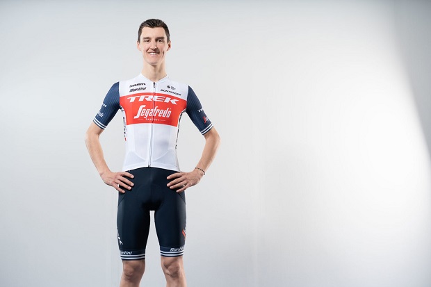
“The current kit is an evolution of the last few years, but even if you go back to 2014 when we had our first Trek Factory Racing team, it was still really minimal and clean. It was black and white with some tonal pinstripes. The same idea held true then: we wanted to keep it clean, pretty minimal, and timeless. I think some of our kits have aged better than others, and over the years, we’ve learned through rider and fan feedback,” admits Lindstrom.
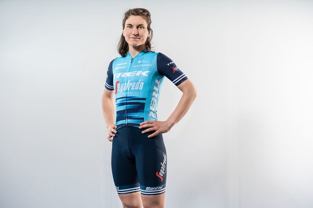
“Trek over the years has defined its DNA of what a Trek kit looks like, so we’ve got a pretty good formula,” says Lindstrom. “We always like to be clean and classy with a minimal color palette that complements our sponsors’ logos. Then we go for some basic clean color blocking. We like our kits to be timeless.
“We try to provide a few different options to break outside the box to see how much we can push the envelope. We’ll throw some off-campus stuff in there that’s off-the-wall crazy that maybe Trek hasn’t done yet, but that we always consider whether it’s for a special limited kit or maybe one day the full season kit.”


